Mobile App Redesign
Redoing the mobile app to make the loan application process seamless and user-friendly for house flippers on the go.
Background
During my internship thus far, designing the new Crebrid mobile app has been extremely important. Previously, there was no app for the company. Entering the modern market, a mobile application is paramount to company success. The app needed to be as simple as possible and feature key information without it being overwhelming.
During my internship thus far, designing the new Crebrid mobile app has been extremely important. Previously, there was no app for the company. Entering the modern market, a mobile application is paramount to company success. The app needed to be as simple as possible and feature key information without it being overwhelming.
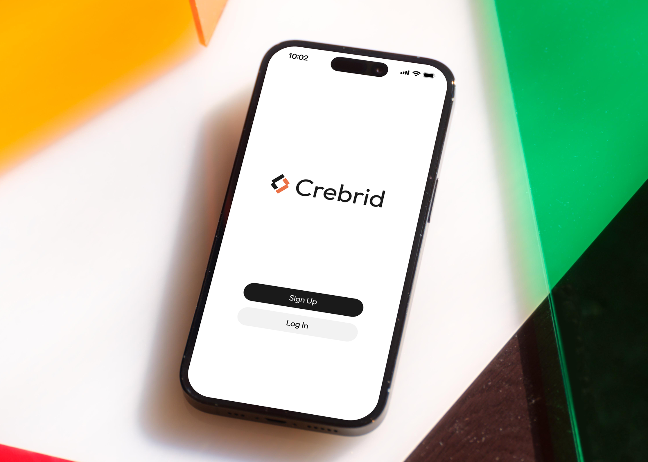
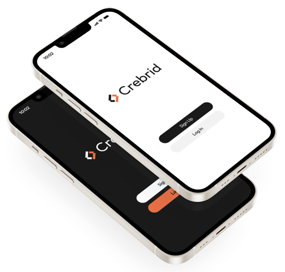
The app went through substantial changes, and is now set to launch within the upcoming weeks. So far the app is only available on IOS, with plans to expand to Android.
Users and Pain Points
Crebrid's primary users are real estate investors, borrowers, and partners seeking funding or investment opportunities. Through stakeholder interviews, a brand audit, and site analytics, we identified several key pain points:
Trust & Security
Modern Branding
Form Complexity
Accessibility
Solutions
The new app needed to be simple and efficient. With the revised branding tool kit from Takt, I started implementing a revised structure that would enhance the user experience.
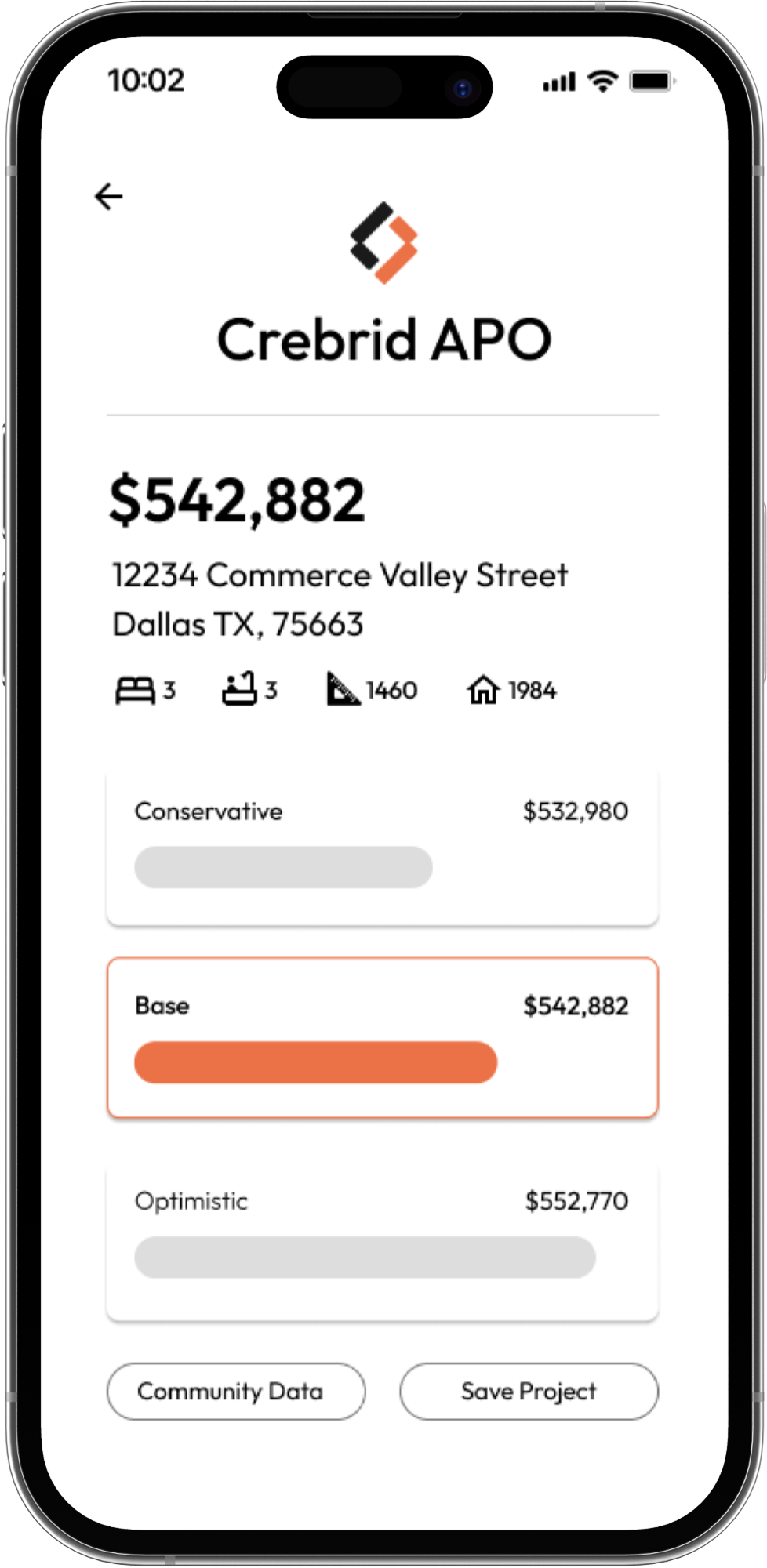
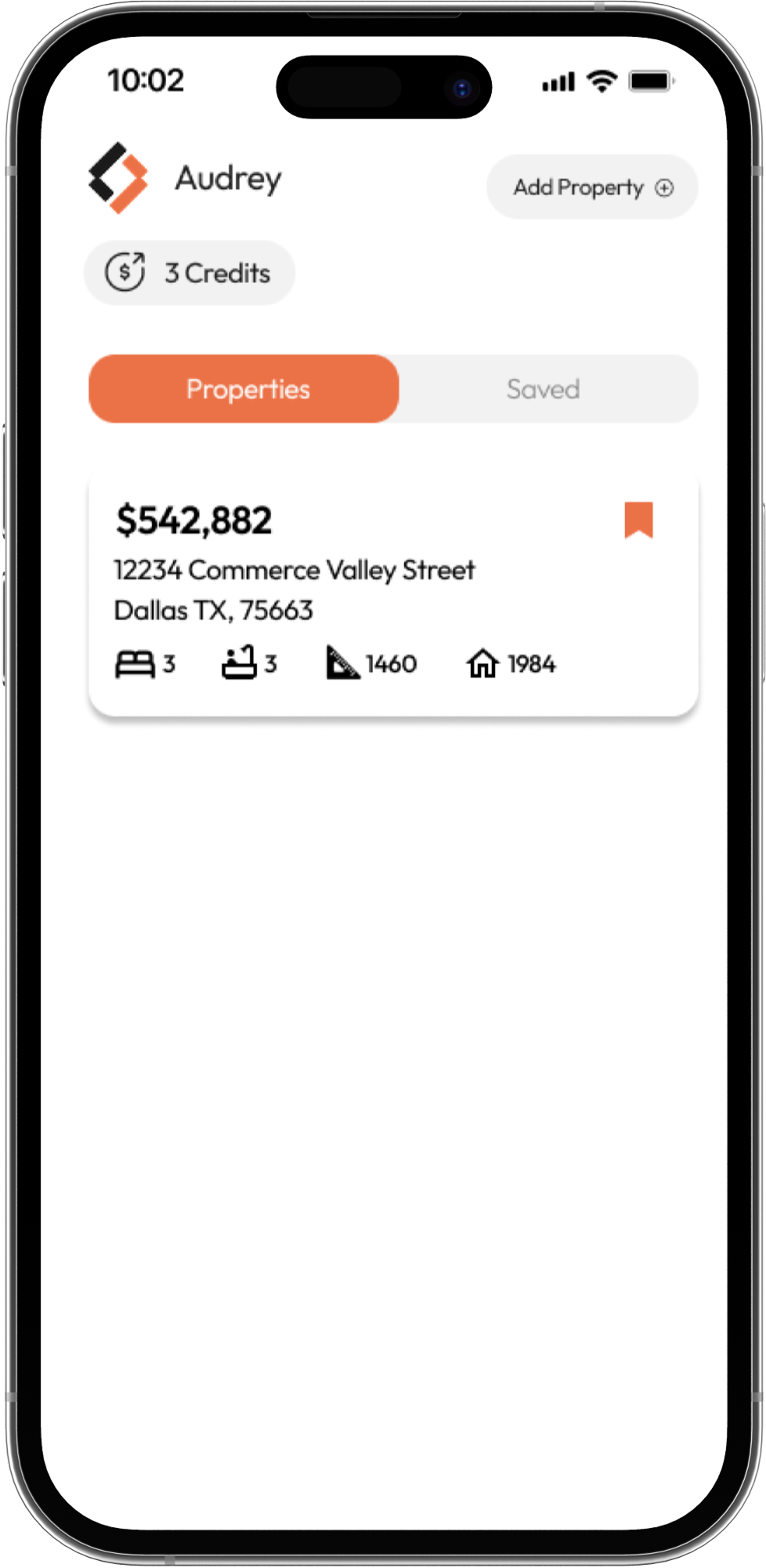
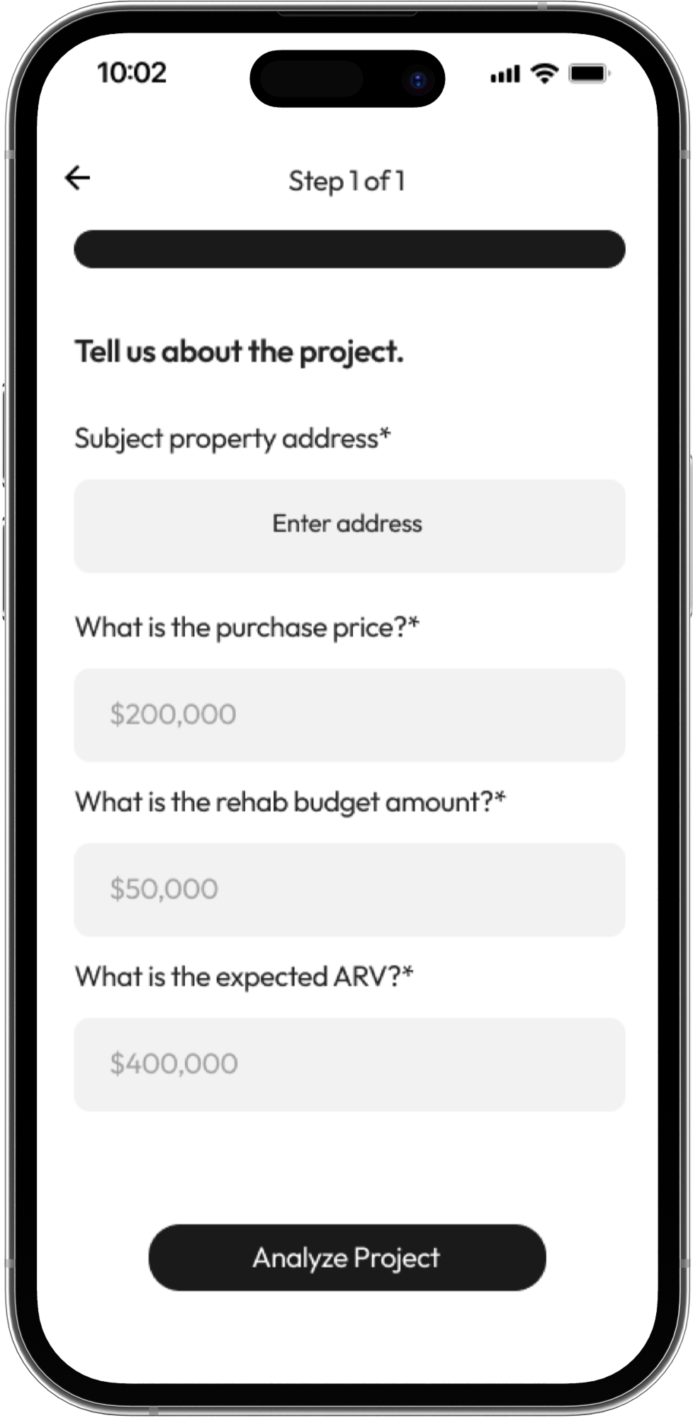
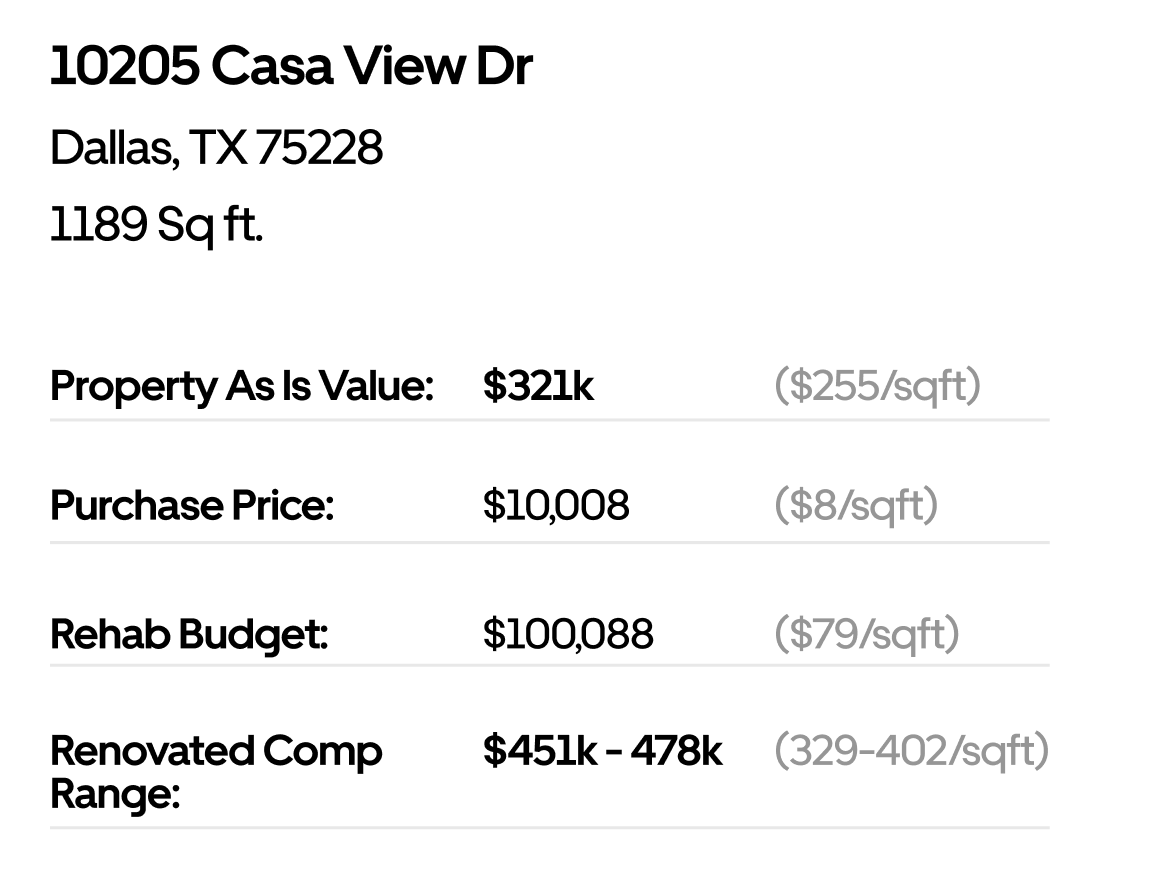
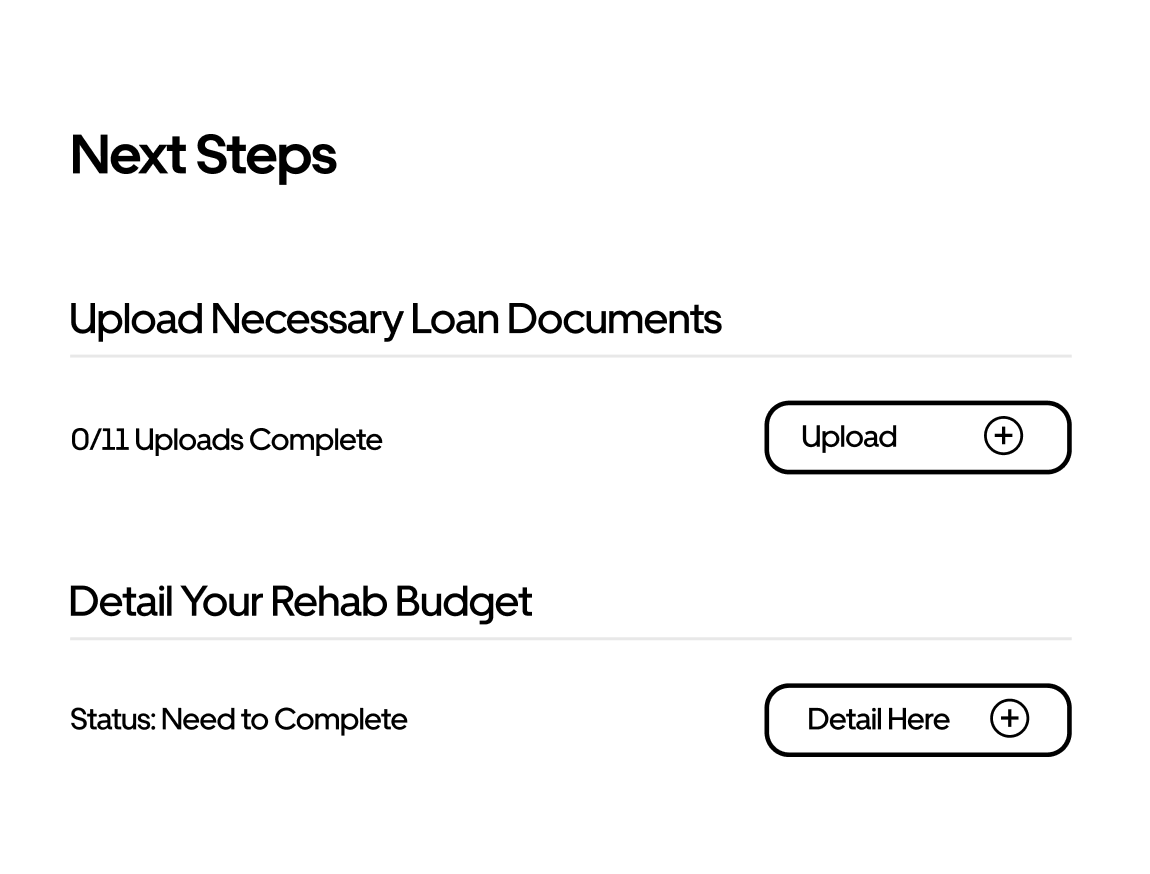
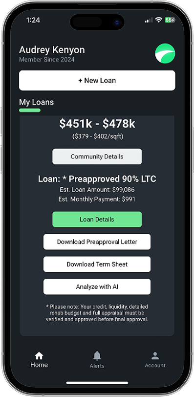
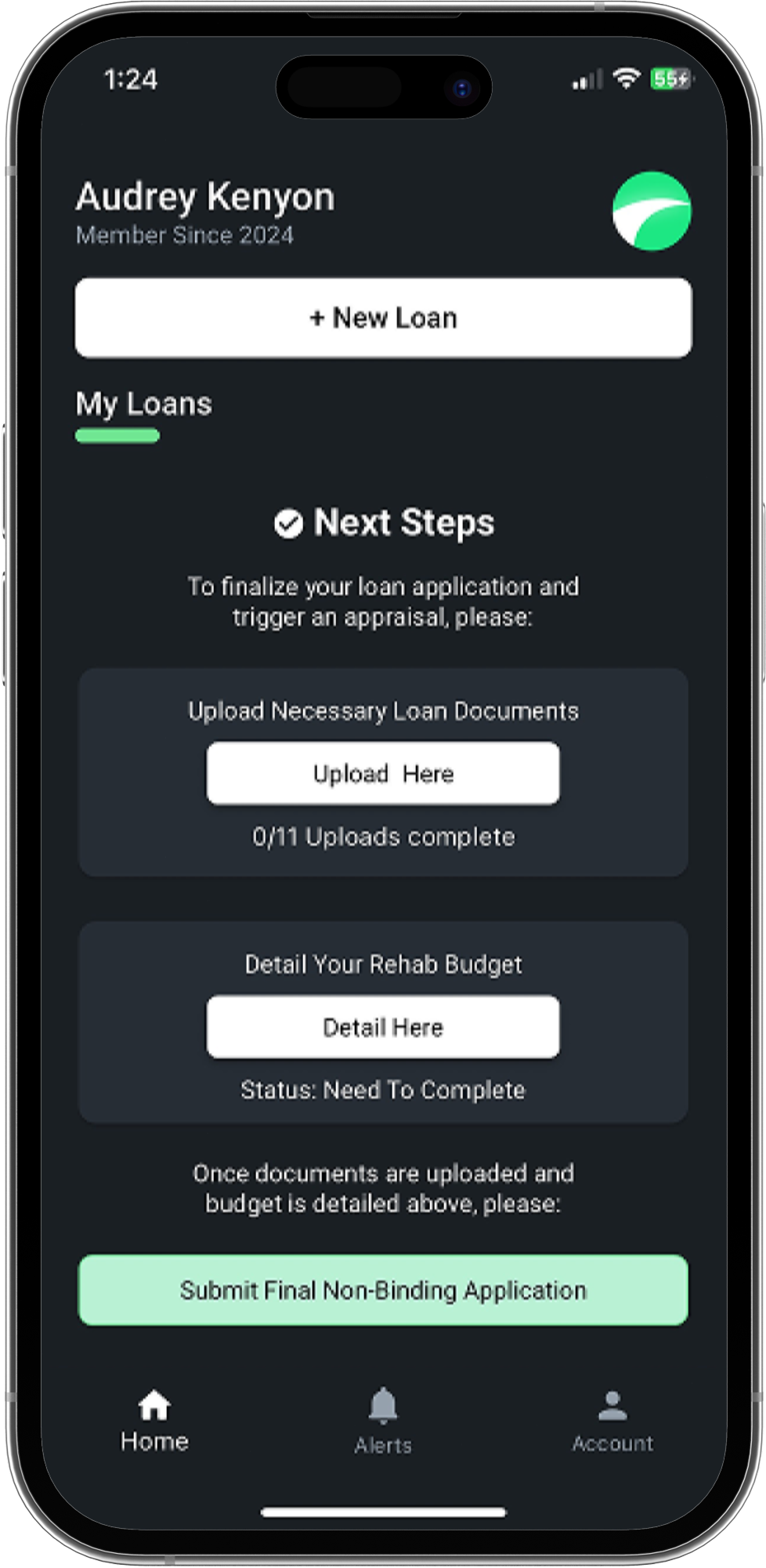
The first phone showcases the new project view page. This page needed to display the value of the property, its relevant information, as well as Crebrid’s predicted value for the property after the suggested renovations occurred. A Conservative, Base, and Optimistic model is proposed to the user, with the most likely outcome being highlighted and emphasized in orange. Users can also examine the Community Data, which displays information about homes near their target property. The second phone shows what the home page looks like once a property has been added. It is simple and sleek, but it highlights the necessary information for the user. The final phone shows the property request form. For now, the form is simplified to one page and asks the immediate relevant information about the project.
These screens showcase how I have enhanced the visuals of the app, as well as implemented a superior user experience.
Challenges
Core Purpose
The app changed in purpose several times. At first it was intended to be the most important aspect of Crebrid's branding, which meant that it would include every feature possible. The most recent edition, however, focuses on key features with supplementary information available on the website.
Design vs. Functionality
The app is created through FlutterFlow and therefore has limited ability to create elements that are atypical. I learned to make sure that my suggested designs were able to be created using FlutterFlow components.
Changing Branding
Before the Design Agency Takt came in to establish a cohesive branding guideline, the App did not have a clear visual direction. The only consistent aspect was modernity, but ultimately the final version differs significantly from the precursors.
Creating GIFs
Learning to create a GIF for the logo was difficult. It needed to be done to serve as the loading screen animation. This was done for several of the prior logo renditions.

Next Steps
As I continue on with this company full-time, one of my main tasks will be completing the visual design of the mobile app. I look forward to further developing the app's identity and making it as user-friendly and intuitive as possible.